CareMynd
The Challenge
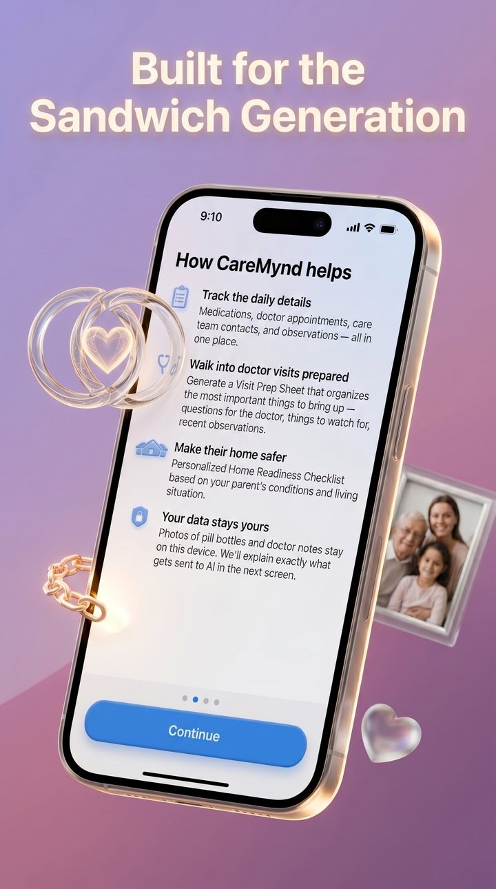
The “sandwich generation” — adult children managing an aging parent’s medications, appointments, observations, and home safety — runs that work out of memory, group texts, and scraps of paper. The opportunity was a single organized place for it. The hard part was the constraint.
CareMynd is an organizational tool, not a medical one. It does not diagnose, treat, or recommend medical interventions — and it can never imply that it does. Every structural and interaction decision had to reinforce that line while still being genuinely useful. That tension was the design brief.
Strategic Structure
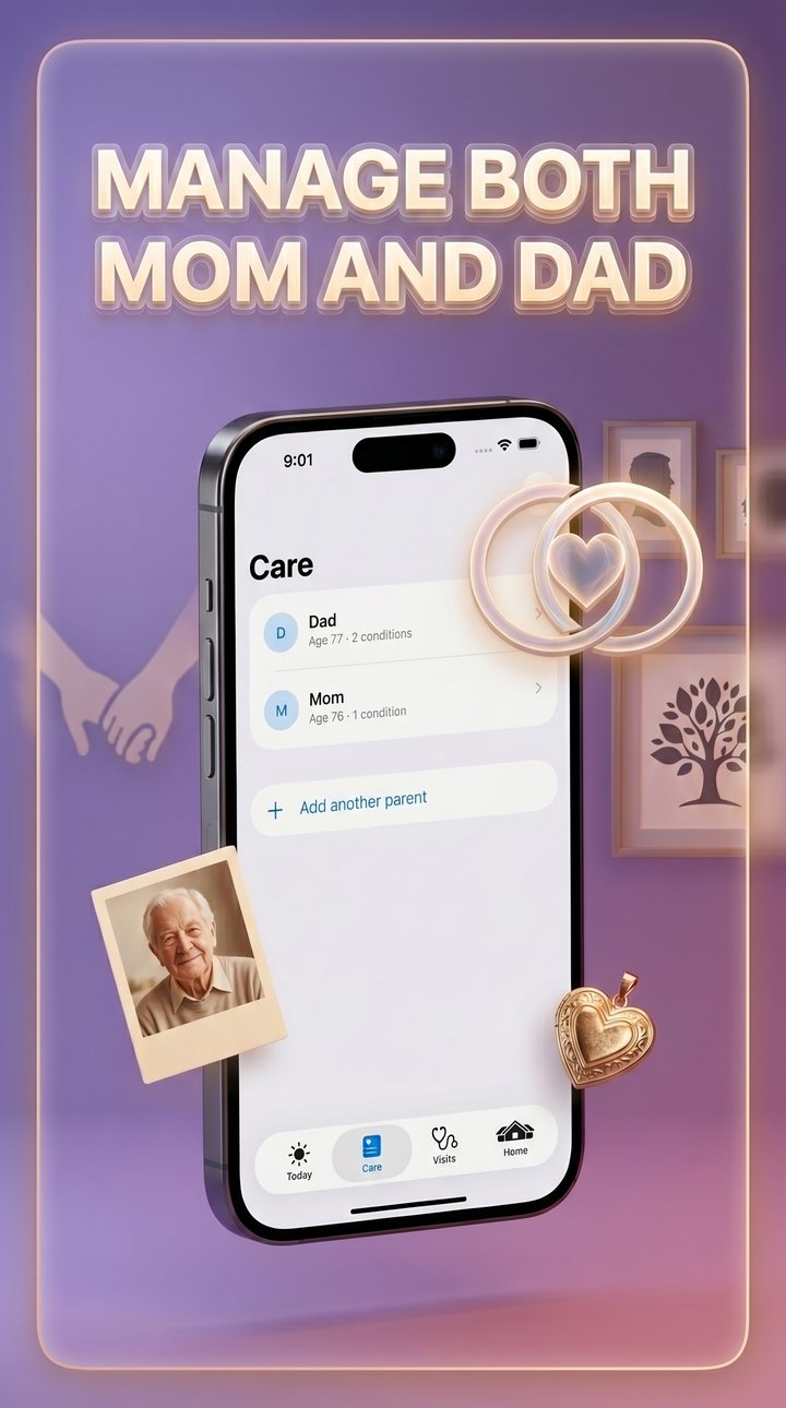
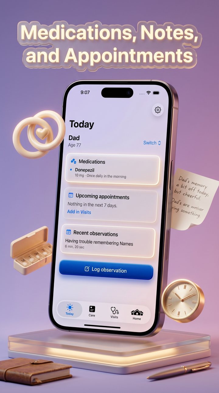
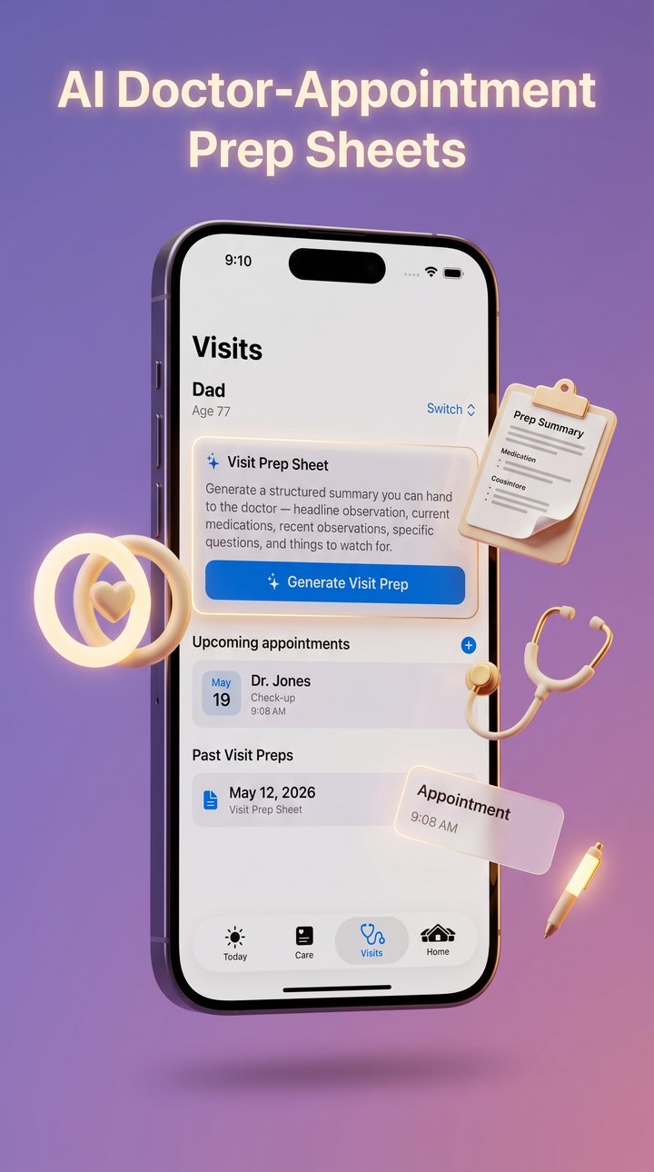
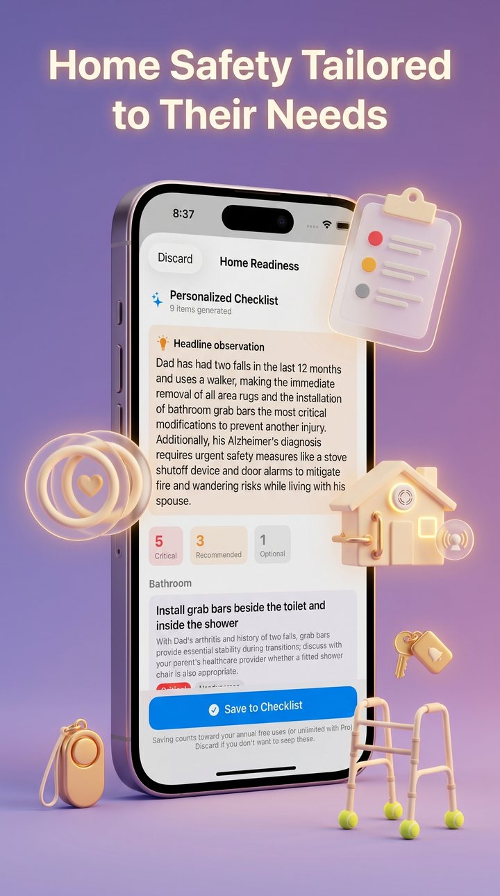
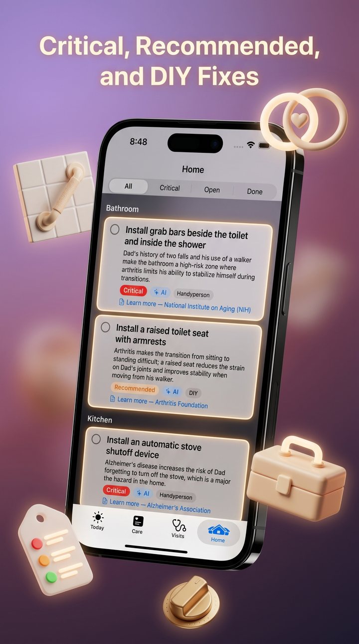
Caregivers act in the moment, one-handed, often standing in a kitchen or a waiting room. I structured the app around four clear jobs rather than a feature list: Today (what needs attention now), Care (the parent’s profile, medications, and observation journal), Visits (preparing for and recording doctor appointments), and Home (home-safety readiness). On iPad the same model expands into a split-view sidebar — a deliberate size-class branch rather than forcing one navigation pattern across both.
Designing the Trust Boundary
Because the app is medical-adjacent, “trust” couldn’t be a tone — it had to be built into the flow. The decisions that did the work:
Outcome
CareMynd shipped and is live on the App Store — through Apple’s review for one of the more scrutinized categories, an AI tool in a medical-adjacent space. It stands as proof of the harder skill: not making an AI feature flashy, but making it responsible, legible, and genuinely in the user’s control.
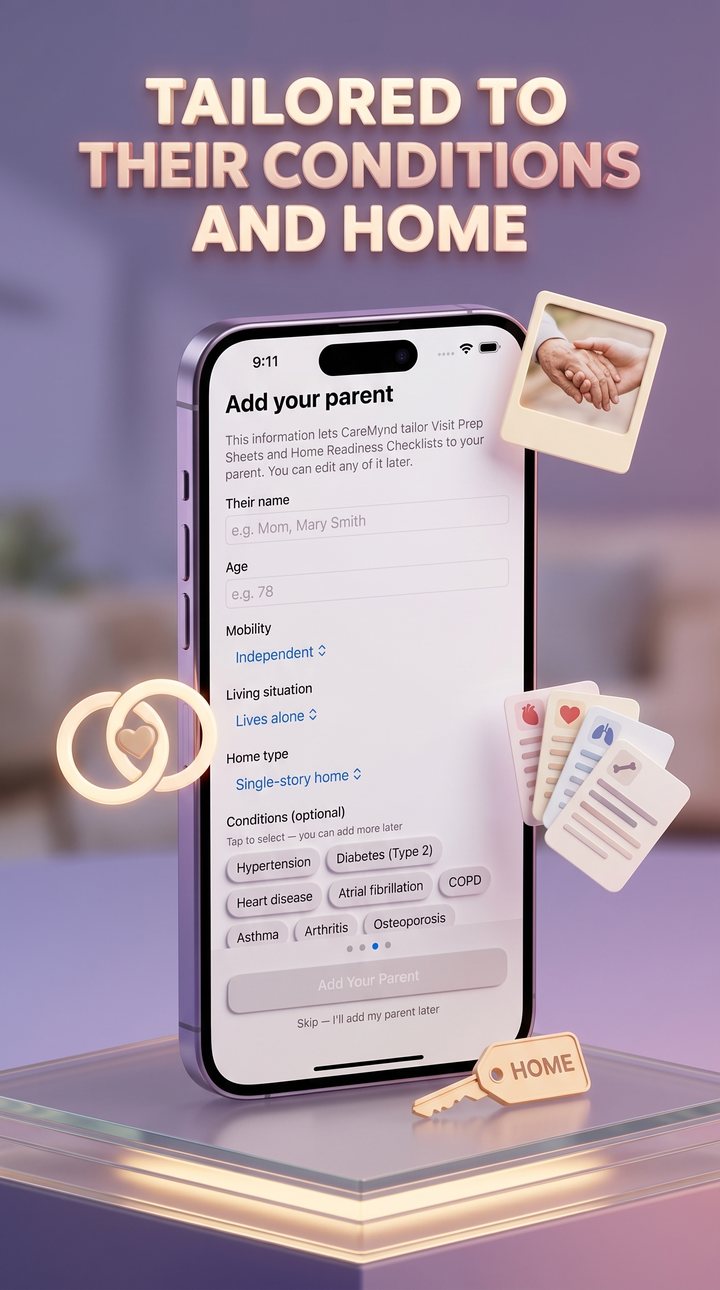
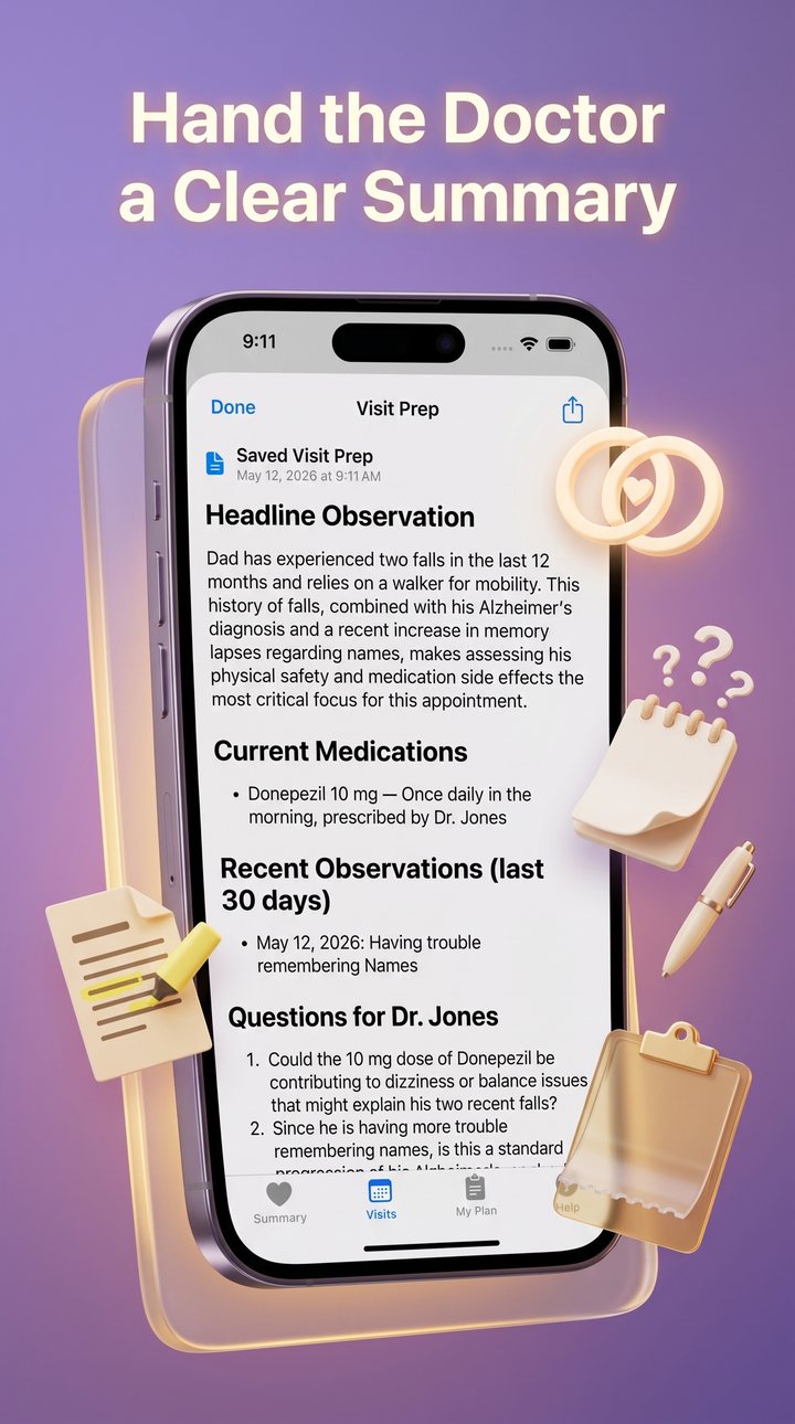
Walkthrough — Screen by Screen
The shipped product, in narrative order — from framing who the app is for, through the organizer itself, to the two AI artifacts a caregiver carries into a real appointment.